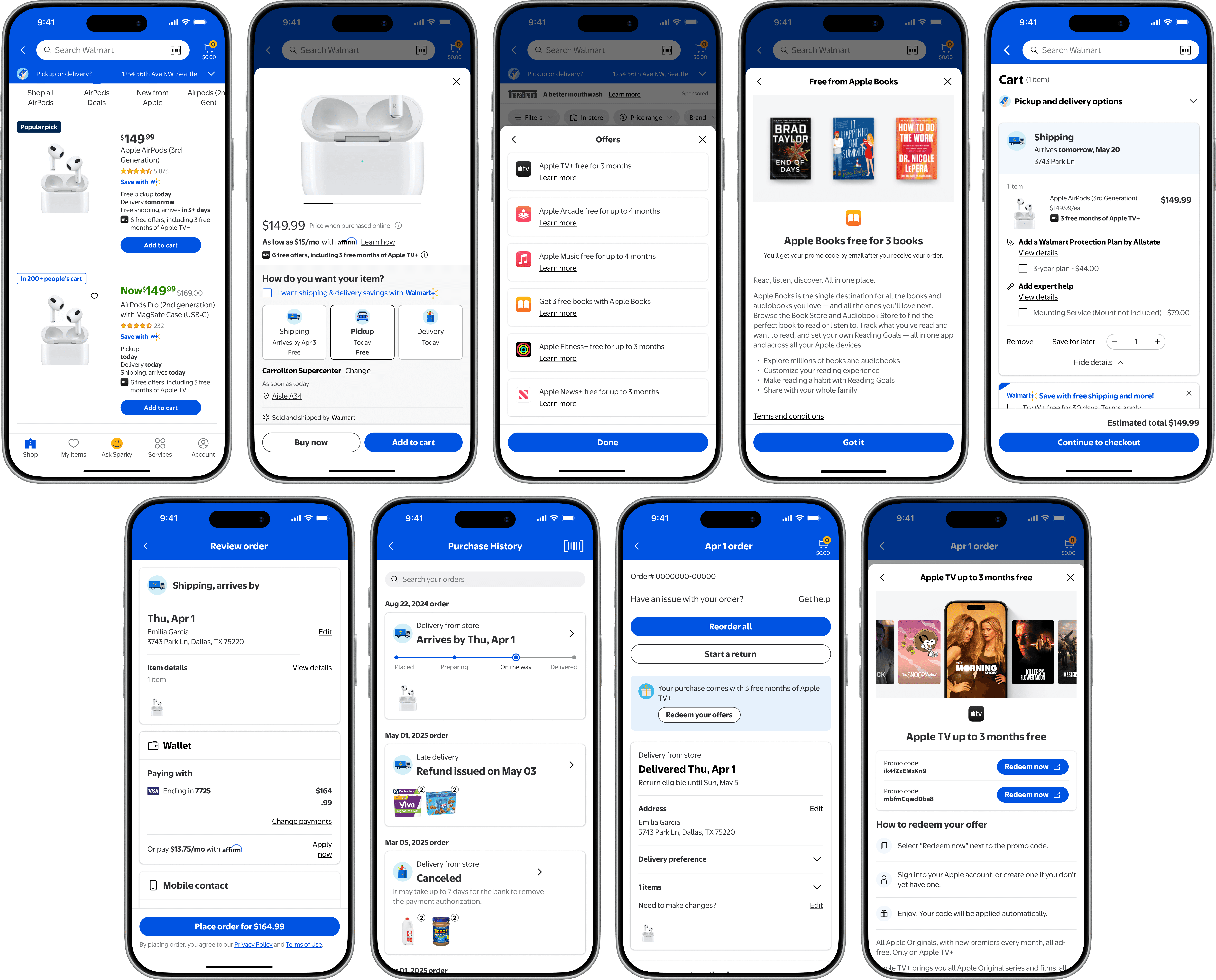
Walmart x Apple Bundle Service
Project background
Apple’s proposal
Apple proposed partnering with Walmart to promote free trials of its services (e.g., Music, News, Books, TV+, AirPods) via banner ads on Walmart’s eCommerce pages to reach everyday shoppers.
Problem & opportunity
Lack of contextual trial promotion
Walmart.com lacked clear, upfront promotions of Apple’s free trial offers during shopping, causing missed trials, lower perceived value, and reduced activations/revenue for both brands.
Opportunity
Clear, upfront trial information empowers informed decisions, boosts engagement, and drives mutual growth.
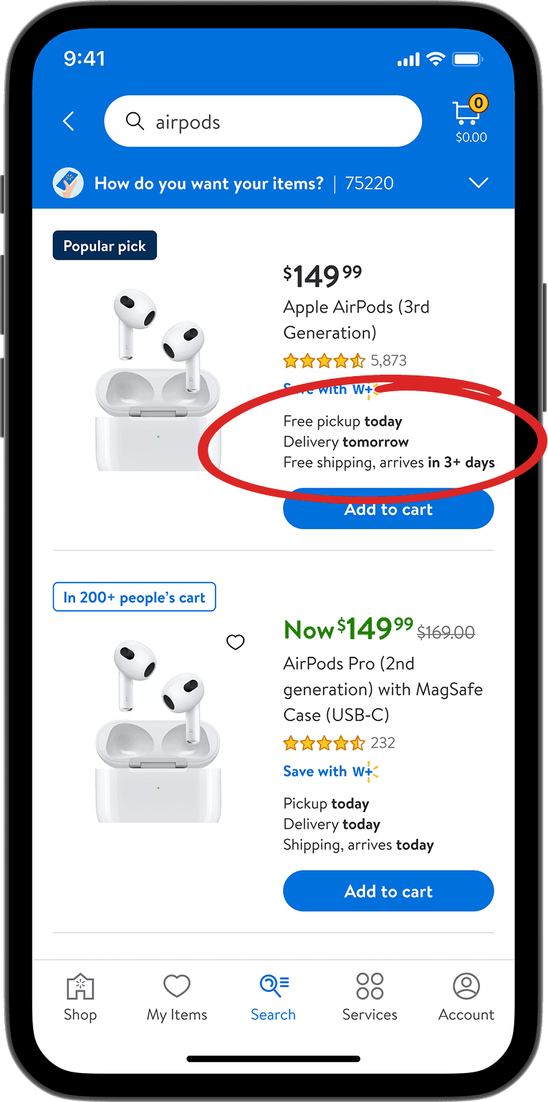
Existing design
Search result page
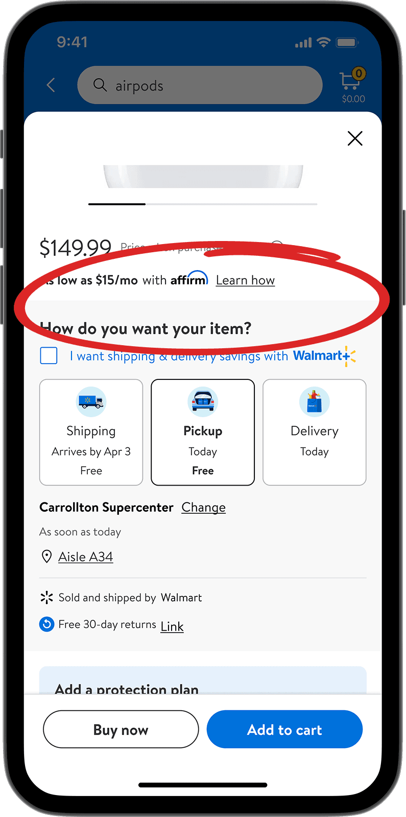
Existing design
Item page
Goal & metrics
Project expectation
Launch a prominent banner highlighting Apple trial benefits with a post-transaction email redemption point to achieve 25% higher CTR.
Primary goal - Build a lasting partnership with Apple by supporting their offers at scale on Walmart's platform.
Secondary target — A 25% lift in click-through, set as a directional benchmark rather than a hard requirement.
Outcome & result
Adopted beyond Apple
Click-through rose 144% and conversion 1.6x, far past the 25% benchmark.
On the strength of that performance, the same pattern was extended to Vizio's product line following Walmart's acquisition.
Process & Exploration
Key decisions and challenge in achieving product success
Choosing the right format for the offer, backed by data
Ad banners were pulling a 0.017% click-through rate: customers ignored them and didn't trust the content. The text-based banners I designed for Affirm delivered an 18% uplift in engagement.
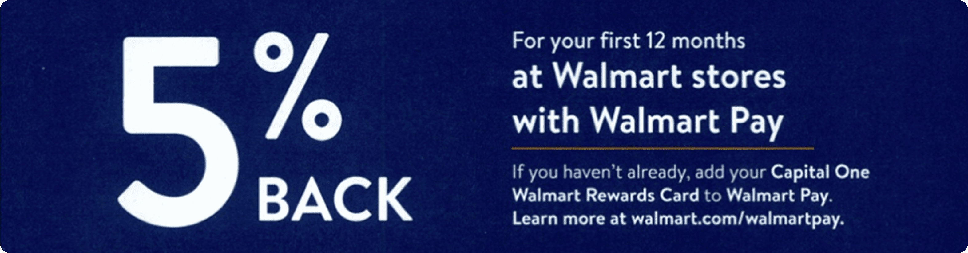
0.017% click-through rate
Advertise banner failed to earn customer trust

18% uplift in engagement
Concise info reduces overload
Serving user intent with transparency
Text-led content works best for users with specific shopping intent, while icon- and image-led banners serve browsing users better. Browsing is exactly our target user's profile. The final version pairs the icon with an exact dollar value, so the benefit is both scannable and concrete.
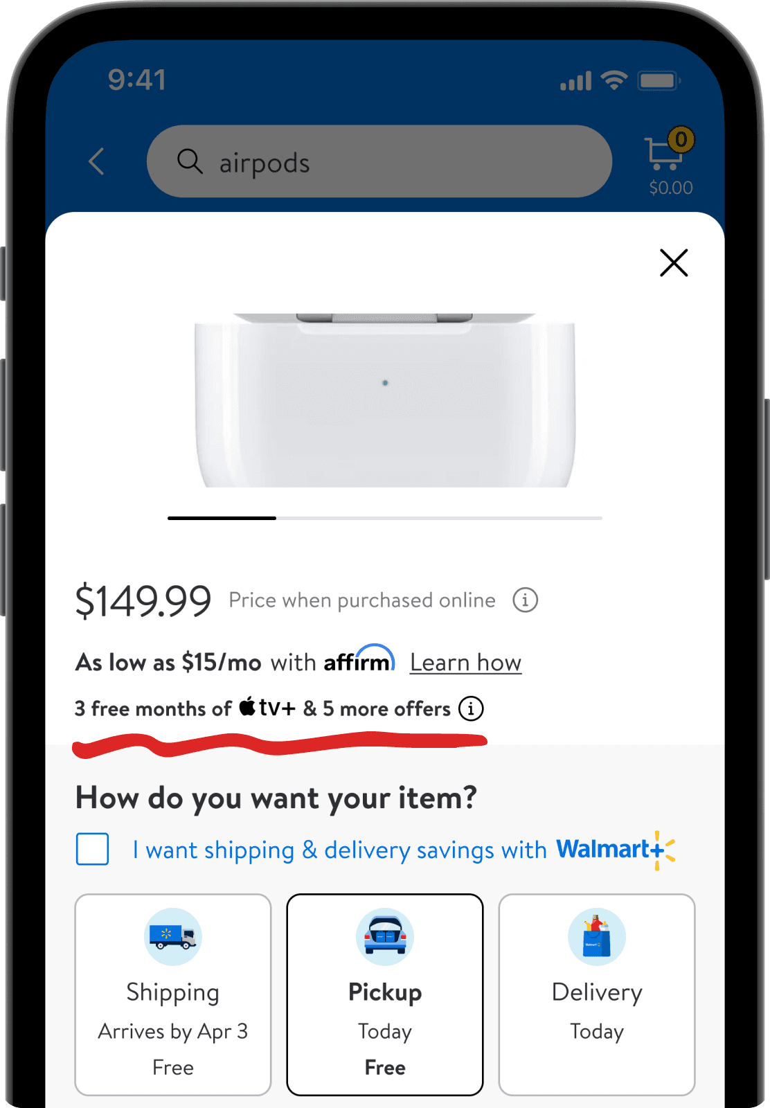
Solution #1
A text-led banner fits better for users with specific shopping intent
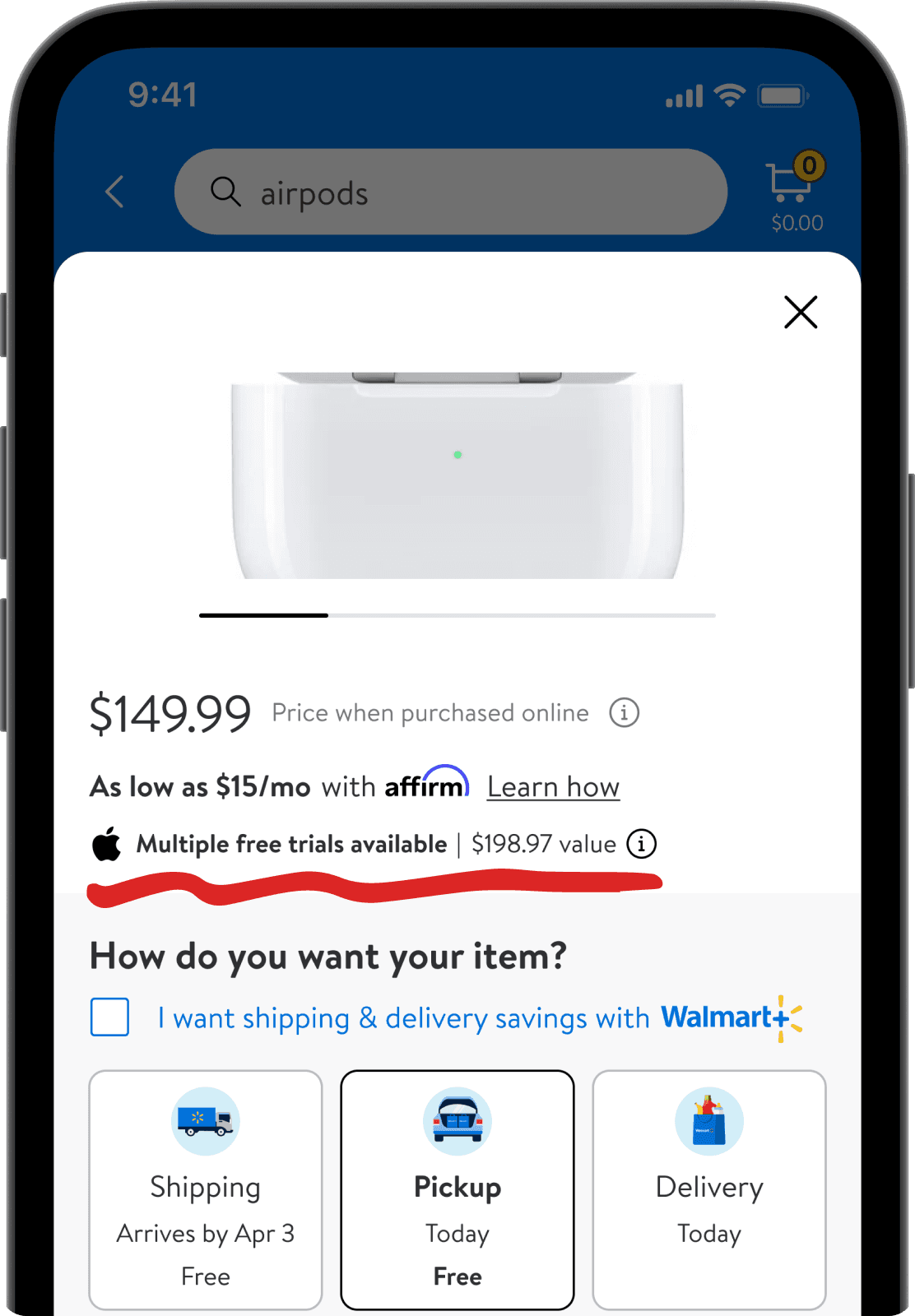
Solution #2
An icon-led banner message fits better for users with browsing intent
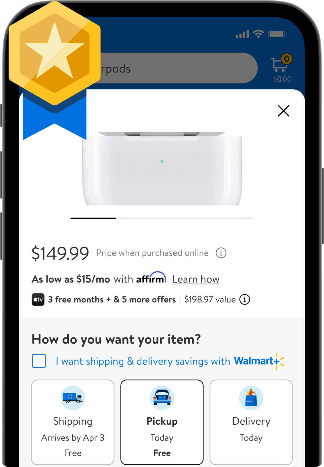
Solution #3
Adding an exact dollar value and service icon brings better clarity
A scalable template that cuts engineering effort
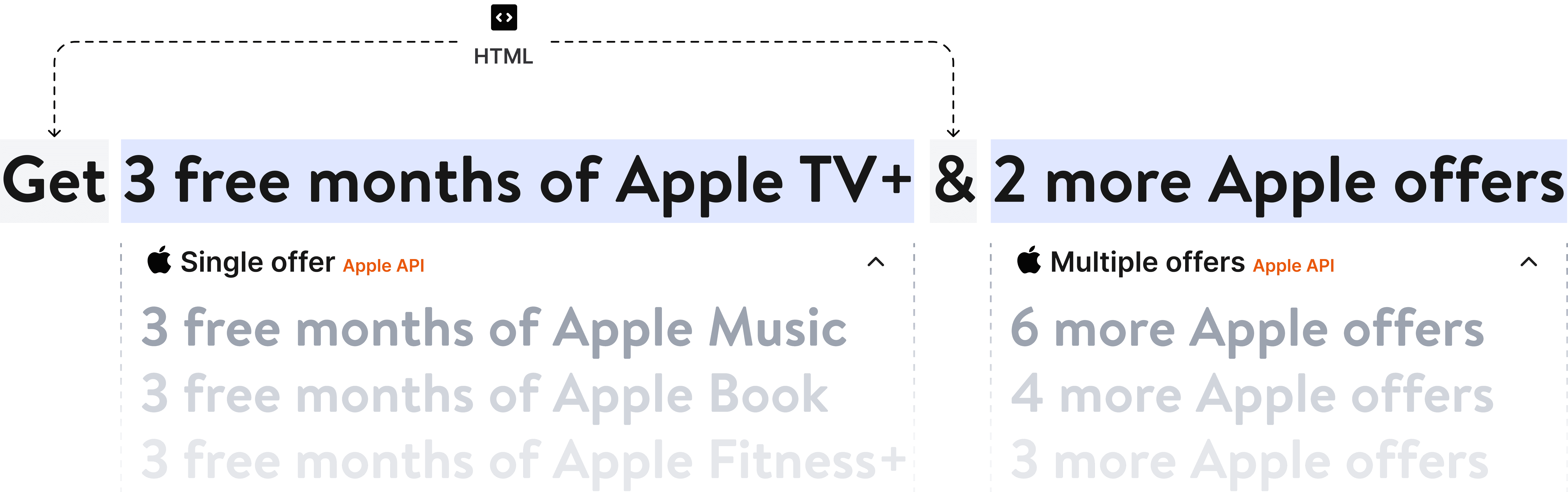
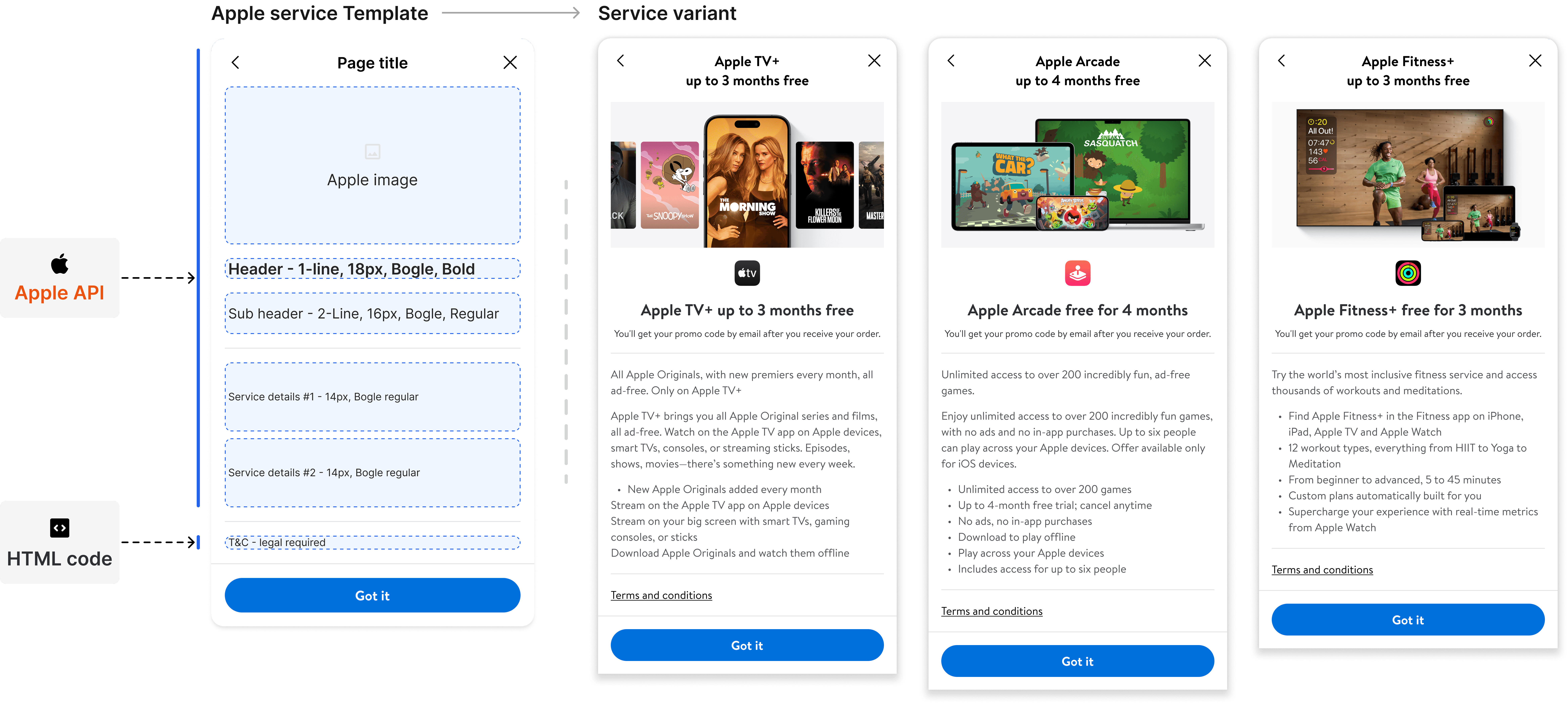
I worked with engineering to build a template that pulls service information and benefits directly from Apple's API. It handles both single and multiple offers without hard-coding. This lets Apple update the content on their side as their business strategy changes.
Process & Exploration
V1.0 design exploration
Shopping experience
The exploration of the banner helps build a great start to test the banner length on different page and led to different component variant depends on the length limitation.

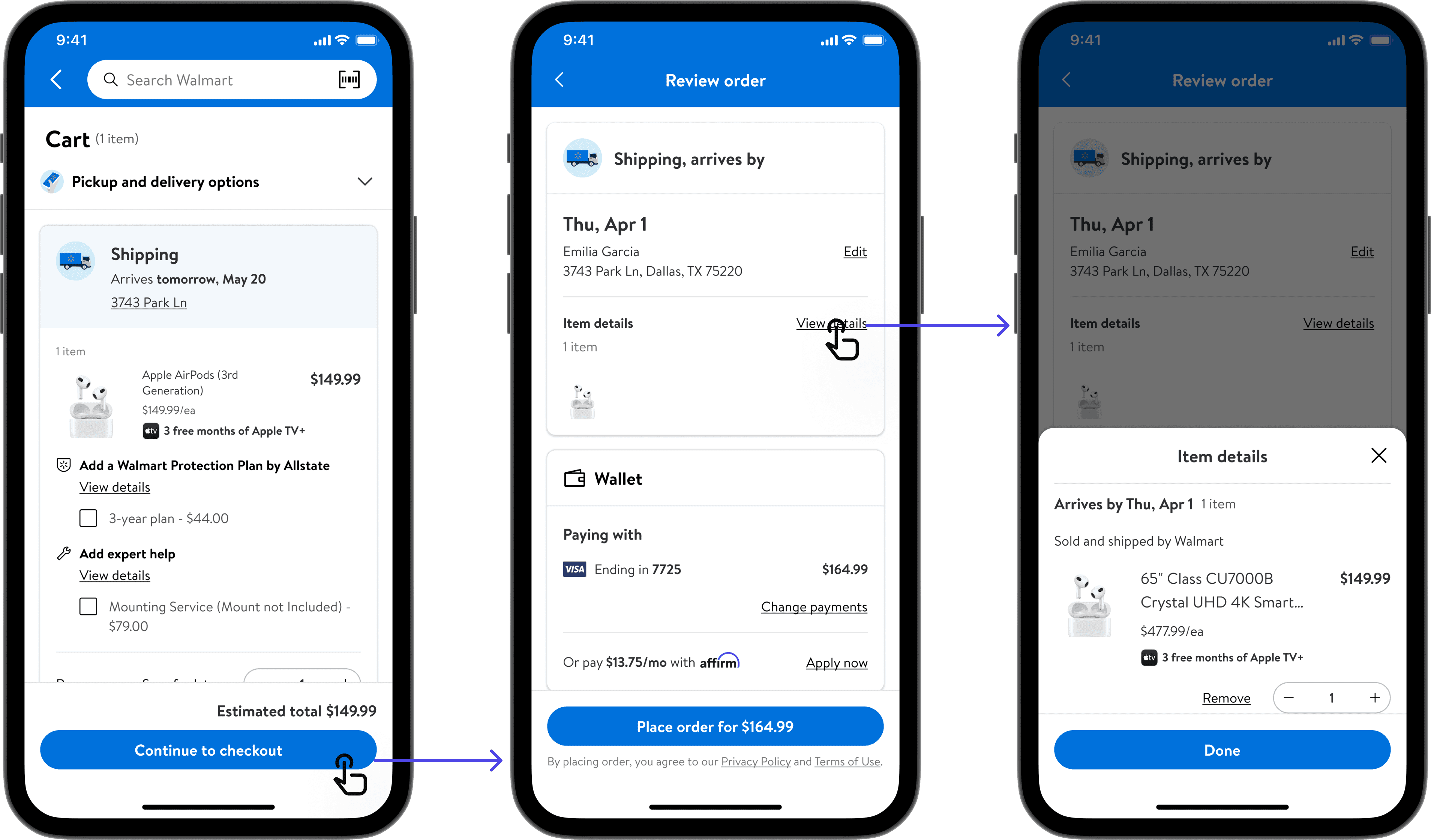
Checkout experience
During my design process for V1.0, I expanded the banners to the entire journey, including cart and checkout, to maintain consistency.
Post-transaction experience
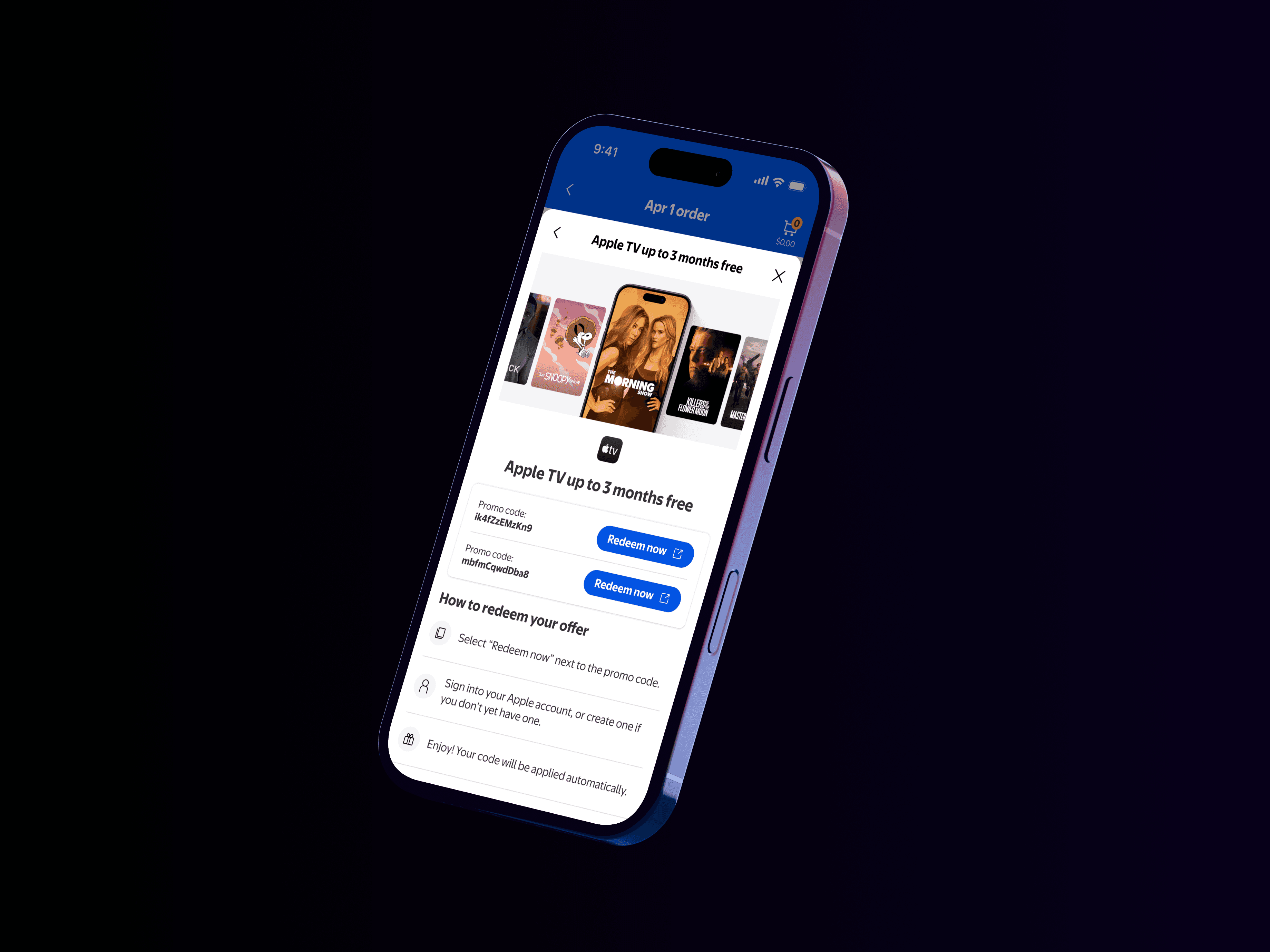
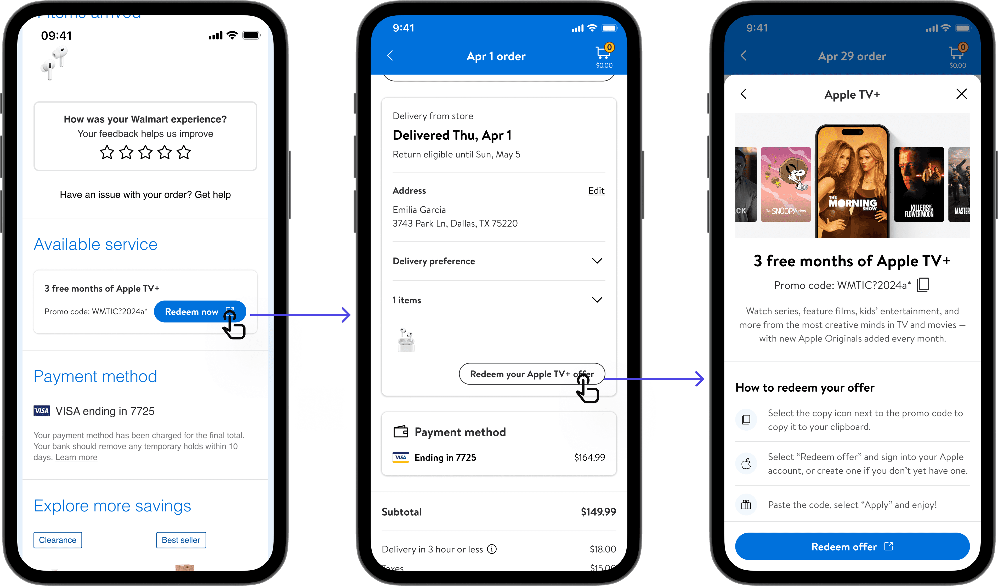
I also introduced post-purchase entry points in thank-you pages, emails, and claim pages, creating a cohesive flow that aligned expectations and simplified redemption for Sara.
Process & Exploration
Feedback & learning
" height="15.320810875267782px" id="IYdNNc84q" transform="translate(4 4.338)" width="15.6583px"/></svg>)
Apple complimented the sustainable designs for banners, detail pages, and claim flows.
" height="15.320810875267782px" id="GMIZqjTeD" transform="translate(4 4.338)" width="15.6583px"/></svg>)
First, they flagged the dollar values as a legal risk: state tax variation meant a precise figure could mislead users about actual savings.
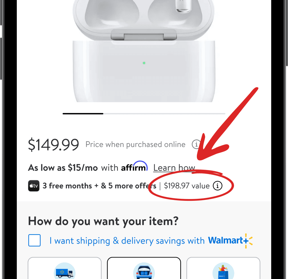
Before
V1.0-Product item page
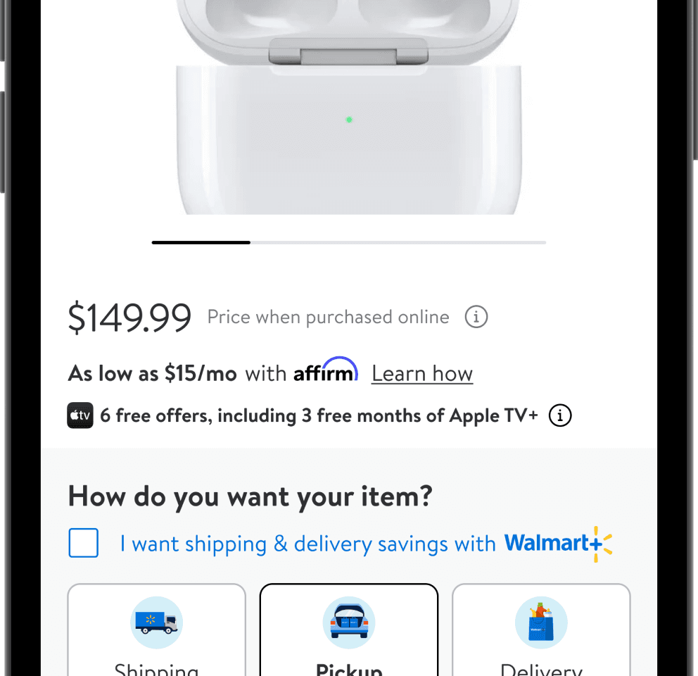
After
V2.0-Product item page
Second, they flagged the copy-paste icons on redemption codes, citing rising promo code fraud.
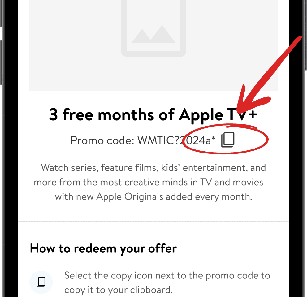
Before
V1.0-Product item page
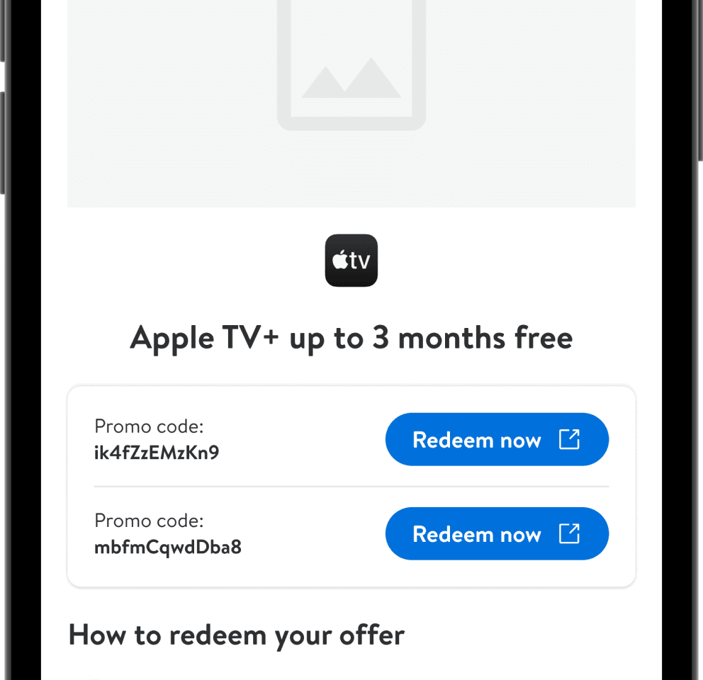
After
V2.0-Product item page
Outcome & result
Final design & handoff
👉🏻 Click to